Showing posts with label my take. Show all posts

Thursday, 10 October 2013

The Angel Of Vengeance.

Have I mentioned previously that I might have an idea for the third part of my movements assignment, involving creating a poster/cover/something to do with a story that I am writing? Yes? Well, I am going to do it. 

I usually wouldn't post about this until after everything is said and done, because I hate to think of everything failing and me still having all this work up here as if things are going great, but I think it would be a good thing to put my planning here. It might motivate me to get things done, even if the first few attempts fail. So here it is - the first planning stages of my next assignment. 

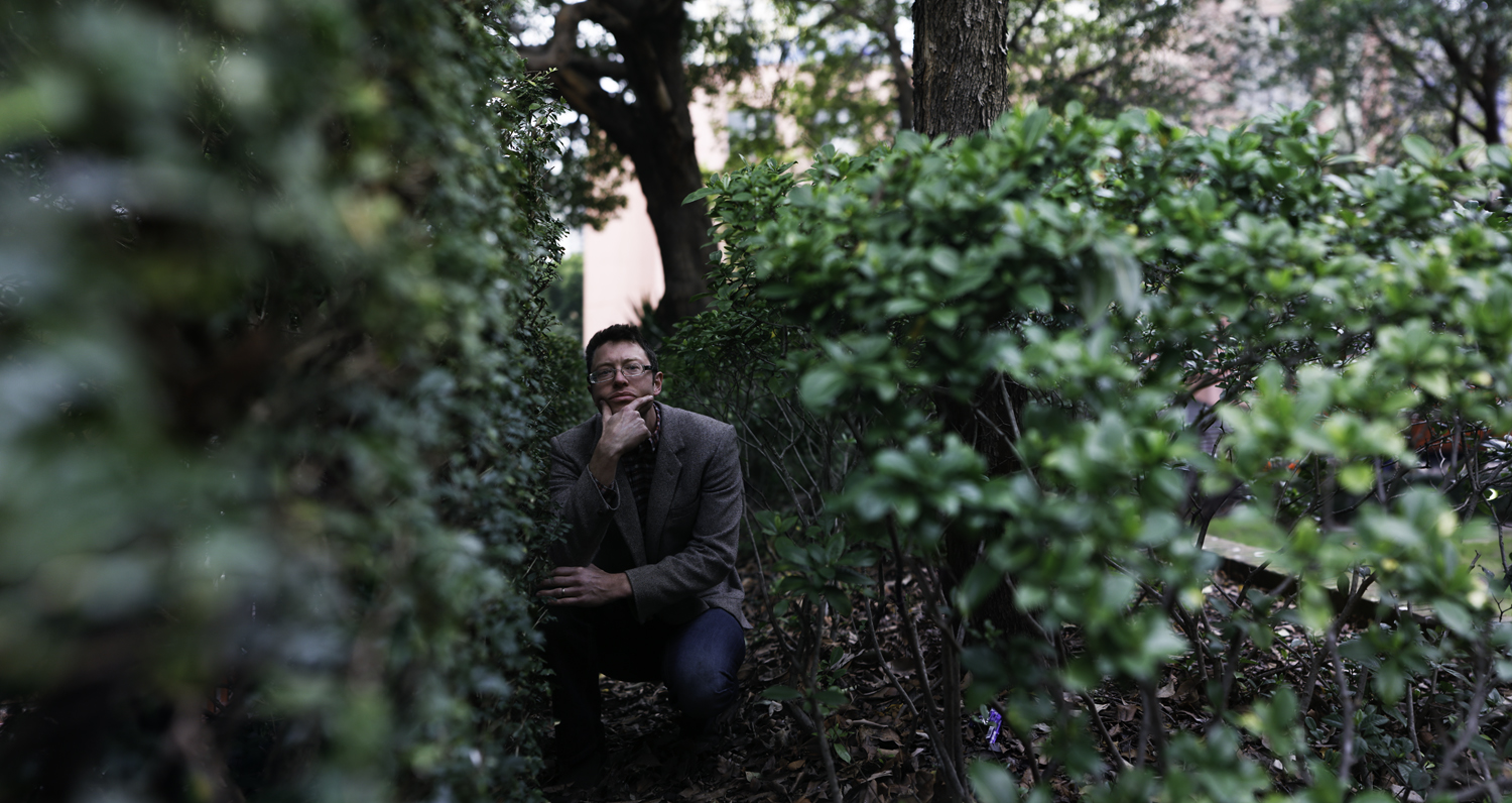
I decided that I wanted to make a book cover/movie poster type thing for my current work in progress, The Angel Of Vengeance. I'm not going to bother finding perfect models for my characters - because let's face it, nobody's going to know the difference expect me! So this weekend I have my best friend coming over, and I'm probably going to end up using my two brothers as my two main male characters. (There is the potential of a third male character coming into play, and I have a co-worker in mind should this happen.) 

I have a general idea of how I want things to look, so I put my amazing drawing skills to practice and drew a mock-up: 


Gosh, what am I doing photography for?

Obviously, this isn't perfect. But it's an easy way of reminding myself how I plan for things to look. I also searched around on Google and found some images for inspiration, ideas, and for the way that I want things to look. It doesn't cover everything at the moment (because a lot of things are still just in my head, too) but I threw it all together and created a mini mood board: 


I want the image to be more dark than light, and I don't want the background to be distracting - which is why in the background inspiration images up there, we've got brick walls and smoke. 

Here's another thing I wouldn't usually do: give away spoilers, but in the spirit of noting down all of my idea-ing here... 

I want to try to create this image using only photos - as in, not artificially creating anything in Photoshop from scratch. It will be a challenge for me I think, but I'm up for it. Given the nature of the story, it's going to be interesting - so here are some ideas for how I intend to create the...crazier-looking things.

Zoe will potentially have lightning coming from her hands. Unsurprisingly, I've never managed to obtain a great image of lightning. I considered buying a plasma ball and taking shots of that, but then as I was walking to work on Tuesday morning another idea struck me. As I looked up into the trees, I was amazed at how much their branches looked like lightning strikes. And so I intend to use tree branches. 

Paris's hands were a little more difficult at first, but then the idea was obvious when it finally came to me - coloured smoke (or maybe just white, we'll see) and a sun flare or two. Again, we'll see how things go. 

Nathaniel has a force field surrounding him. When I first attempted a practice image on my brother, I followed a tutorial online that showed you how to make a force field. I didn't really like the look of it, but I figured it would do if I needed it. (I didn't save this image, so I sadly can't post it here!) But as I want to create this image now using only photos, I came up with a simple idea: shooting the rim of a glass. 

I also want to shoot a glass with a sparkler inside of it - both because it might create another interesting lightning shot, and because it might make for an interesting force field. 

If the third male character is included, he will be behind all of the others - looking back at the scene over his shoulder. 

This is obviously going to take quite a bit of work, and I don't have all the time in the world, but I have my hopes that it will work. If it does, then I'll tackle the issue of how I'm going to print it.

Wednesday, 7 August 2013

The Pinhole Camera.

Last week we were discussing pin-hole photography, and as part of our homework we were to take a shot using a pin-hole lens. As I'm not in class today due to illness, I figured I would update my blog with the shot that I took last night. 


Obviously, something went wrong. 

Pin-hole shots are supposed to be known for their sharpness, and often vignetting around the edges. My shot isn't sharp at all! The only conclusion I can come to is that my home-made lens just didn't cut it. We don't own a drill, and I didn't have access to one (nor did I really like the idea of destroying one of my lens caps!), so I wrapped a piece of foil around my camera and stuck a pin through the front of it to make a hole. 

Maybe it wasn't straight; maybe the hole was too big or too thick. Whatever the case, my shot didn't work. But it's all part of the learning process, right?

Saturday, 27 July 2013

The Brenizer Method.

In Wednesday morning's theory class, we learned how to use the Brenizer Method to create wide-angle photographs with the depth of field that is usually associated with either tilt-shift or telephoto lenses.


The method involved taking a series of shots, while keeping the film plane/sensor of the camera in the same place. 

First we focused on our subject, to make sure they would be sharp within the image, before switching to manual focus. A long focal length (preferably over 100mm) and a wide aperture (f/2.8 or wider) were used. 

Using this method reminded me of the joiners that we saw while studying Cubism. Making the image required taking several shots of the scene and then merging them together in Photoshop (we did this by using Lightroom's "merge to panorama in Photoshop" command). The difference here is that it looks like a straight image, as the eye sees it, as opposed to an image filled with different perspectives as you would get with a joiner. 

I was unsure about this method at first, but really came to like it - after realising that I had used it before without even knowing it!

I can definitely see myself using this again in future, a lot.

This method is particularly good when you need an image of great size and resolution.

Saturday, 25 May 2013

More Cubism.

After being inspired by this photo and this photo, I took my own shot at cubism: 


I liked the way that the first shot looked like it was shot through a prism or even a kaleidoscope, but I also liked the simplicity of the second shot - so I worked to combine them. I didn't like the idea of an entire joiner.

Obviously I've also done some colour editing with this, simply because I didn't like the original colours - and why not experiment, right?

Thursday, 2 May 2013

MY TAKE: Surrealism and Pop Art.

Lately I've been straying from photography, though not by choice. Camp NaNoWriMo rolled around, so first-drafting of a novel ensued, and then every spare day I had I ended up getting called in to work. So what was supposed to be a holiday turned out to be a time of work, and every spare moment that I had intended to use to catch up with all of my TAFE work ended up being filled with tedious, stressful life. 

Stress. That's what I've been feeling lately - and it's been getting in the way of things. Namely, my creativity and my inspiration. So today I tried to forget about the stress. While I was on the train to class, I saw something I liked and I took the shot. And then I realised I could use it as my take on surrealism. 

Instagram isn't always bad. 

I loved the way that the reflections in the window made it look like a double exposure, almost like the light was continuing on as one continuous tube as opposed to three. I like reflections. I can't deny that.

Yesterday I also bluntly stated that I hate Pop Art, though I could never quite put my finger on why. I think it's mainly the vibrant colours and the way that they clash so brutally. So when I tried to work on some Pop Art tonight, I challenged myself to create something that I could be happy with. And I think I have achieved that with my shot. I don't hate it, which is saying a lot here.

Either way, you can't go wrong with cats, right?

Monday, 18 March 2013

MY TAKE: Pictorialism and Modernism.

I had planned on using the weekend to catch up on things for my blog - namely taking my own shots in the style of the pictorialist and modernist movements, but I've been sick since Friday and just haven't had the energy to do anything. So today I've gone through some of my old photos instead, and I think I've come across a couple that work. 

Pictorialist

I chose this shot because I feel it fits into the pictorialist category - to me, it looks like it could just as easily be a painting. Nothing is truly sharp. This photograph was achieved by photographing the reflection of this tree in our backyard swimming pool. 

Modernist

Like the previous photo, I feel that this shot fits well enough into the modernist category - most importantly, it is sharp. There has been minimal manipulation to the digital negative (the only editing being to darken around the flower) and it shows exactly what my camera was seeing on the day that I took this shot.