Showing posts with label modern surrealism. Show all posts

Thursday, 10 October 2013

The Angel Of Vengeance.

Have I mentioned previously that I might have an idea for the third part of my movements assignment, involving creating a poster/cover/something to do with a story that I am writing? Yes? Well, I am going to do it. 

I usually wouldn't post about this until after everything is said and done, because I hate to think of everything failing and me still having all this work up here as if things are going great, but I think it would be a good thing to put my planning here. It might motivate me to get things done, even if the first few attempts fail. So here it is - the first planning stages of my next assignment. 

I decided that I wanted to make a book cover/movie poster type thing for my current work in progress, The Angel Of Vengeance. I'm not going to bother finding perfect models for my characters - because let's face it, nobody's going to know the difference expect me! So this weekend I have my best friend coming over, and I'm probably going to end up using my two brothers as my two main male characters. (There is the potential of a third male character coming into play, and I have a co-worker in mind should this happen.) 

I have a general idea of how I want things to look, so I put my amazing drawing skills to practice and drew a mock-up: 


Gosh, what am I doing photography for?

Obviously, this isn't perfect. But it's an easy way of reminding myself how I plan for things to look. I also searched around on Google and found some images for inspiration, ideas, and for the way that I want things to look. It doesn't cover everything at the moment (because a lot of things are still just in my head, too) but I threw it all together and created a mini mood board: 


I want the image to be more dark than light, and I don't want the background to be distracting - which is why in the background inspiration images up there, we've got brick walls and smoke. 

Here's another thing I wouldn't usually do: give away spoilers, but in the spirit of noting down all of my idea-ing here... 

I want to try to create this image using only photos - as in, not artificially creating anything in Photoshop from scratch. It will be a challenge for me I think, but I'm up for it. Given the nature of the story, it's going to be interesting - so here are some ideas for how I intend to create the...crazier-looking things.

Zoe will potentially have lightning coming from her hands. Unsurprisingly, I've never managed to obtain a great image of lightning. I considered buying a plasma ball and taking shots of that, but then as I was walking to work on Tuesday morning another idea struck me. As I looked up into the trees, I was amazed at how much their branches looked like lightning strikes. And so I intend to use tree branches. 

Paris's hands were a little more difficult at first, but then the idea was obvious when it finally came to me - coloured smoke (or maybe just white, we'll see) and a sun flare or two. Again, we'll see how things go. 

Nathaniel has a force field surrounding him. When I first attempted a practice image on my brother, I followed a tutorial online that showed you how to make a force field. I didn't really like the look of it, but I figured it would do if I needed it. (I didn't save this image, so I sadly can't post it here!) But as I want to create this image now using only photos, I came up with a simple idea: shooting the rim of a glass. 

I also want to shoot a glass with a sparkler inside of it - both because it might create another interesting lightning shot, and because it might make for an interesting force field. 

If the third male character is included, he will be behind all of the others - looking back at the scene over his shoulder. 

This is obviously going to take quite a bit of work, and I don't have all the time in the world, but I have my hopes that it will work. If it does, then I'll tackle the issue of how I'm going to print it.

Wednesday, 2 October 2013

Assignmenting...Eventually.

The past few weeks have not been good to me. I've fallen off a ladder, contracted ringworm from a cat we rescued, and not completed anything productive that I had intended to. I have, at least, been thinking about my assignments - so that's a start, right? 

To Do
  • catch up on blog; 
  • bring workbook up to speed; 
  • decide on physical or digital visual diary - complete that; 
  • come up with ideas for photo-essay fill-flash assignment - shoot it; 
  • complete part three of movements assignment; 
  • finish portfolio - work out mounting. 
I've been thinking mostly about part three of the movements assignment, trying to work out what I want to do, how I want to do it, how I'm going to print it. For the most part, I get no ideas - except for one that I've had in the back of my mind, that I'm likely just going to go for. 

It's always been an idea I've had, but I've thought about it more and more since Ben asked me about it. I'm a writer - why have I never created any images to correspond to the stories that I'm working on? Maybe it's time I do that. The digital manipulation would come in because I write fantasy, but how would such an image correspond to a movement? I've already tackled modern surrealism. 

I've been thinking I'll just ignore the movement thing and go for gold. This is the last assignment - I want to create something I can be happy with. I might not be able to find the perfect model, but I can at least try to create a stunning image. 

Likewise, I'll hopefully be getting some more shots for my portfolio. I'm shooting Xavier Rudd at Big Top Luna Park, a venue that will at the very least have better lighting than the Hi-Fi. 

I'm hoping to get something productive done before heading back to TAFE next week.

Sunday, 12 May 2013

Linger: Some Final Thoughts.

Today I printed my assignment. Right from the start I knew that I just wanted to do a simple print for my first assignment, both because it would be easier and at this point in time it is just more cost effective for me. I would leave more interesting presentation thoughts for parts two and three of this assignment. 

I printed my black and white photo on some Ilford Galerie Smooth Lustre Duo instead of the usual glossy papers that I would use, because I might preferred the look of the smooth lustre. For presentation to the class, a bigger size might have been better, and I feel I've let myself down by not thinking of this beforehand. This is something to keep in mind for future assignments.

I have permission from both of my models to use my shot for portfolio work. As this was all that I needed it for, that was all that mattered to me.

What would I do better next time? 

Honestly? Everything. I didn't get the exact shot that I was hoping for, so next time I would do more than one photo shoot with the same model. I would do the first shoot, look at my shots and decide on what needed to be changed, then do the second shoot - and keep going until I got exactly what I was looking for. I would also remember to take my shot-list with me to the shoot, because I feel that this would have helped me greatly. 
In terms of the photograph itself, next time I would choose a better location, use a later time of the day, and use either fill-flash or a reflector to get some more light into my model's faces. I feel that this is where I lack in a lot of my portraits - I can just never get my outdoor lighting right, and my subjects always seem to lack the light and contrast that I'm always after. 

As already stated, in terms of printing I would print bigger than the A4 shot I have now, and perhaps print on canvas. Canvas is something that I haven't ever printed on, though I absolutely love the look of it.

Saturday, 11 May 2013

Linger.

This morning I had the photo shoot with Gabby and her boyfriend - and despite thinking that I was as prepared as I could be, I still managed to forget my shot-list at home. Sadly this meant that I only made half the shots that I intended to, but I still managed to get one that I'm fairly happy with. 

Although on occasion I'm still tossing up between this and the previous shot of my best friend in the cemetery, this is currently my final shot: 


My original idea was to have a couple, one of whom was a ghost - young lovers who were separated before their time. The girl might have died in a car crash or some similar, tragic circumstance. I pictured her, transparent and hardly there at all, reaching out to comfort him from the grave; him staring into her eyes, knowing she was there - feeling her, even if he couldn't see her.

That was this shot: 


It didn't turn out quite how I pictured it, so I didn't end up liking it all that much in the end. If I were to shoot it again, I would definitely have them further away from the bush - to render it out of focus and have it less distracting, and maybe have them standing - shoot from the waist up. Definitely make it more intimate. I don't feel that the story really came across here, and that is important to me. 

So back to my final shot. It had the same story behind it, originally - the girl was dead and the boy was mourning her loss. In this one, he definitely didn't know that she was there, watching over him while he stared into the distance. But when I look at the shot now, I see a different story. I see a murderer being haunted by one of his victims - though he doesn't quite know it yet. It's the beginning of a horror story. 

To achieve the way that she looks like an apparition, I used a double exposure. 


As you can see, there is one shot with Gabby in it and one shot without. With my previous assignment attempt, I layered the photos together and simply lowered the opacity of the one with my friend until I got the result that I wanted. But with this one, I didn't like the way the shot looked when Gabby was completely faded.

So for this shot, I layered the two photos together and then used a layer mask to erase the parts of the top photo that I didn't want - a gradient was used to give Gabby's legs their faded look.

I prefer the photo this way because I like that at first glance, people might not notice the oddity. And in horror stories, that is quite often how things go - you don't realise that the ghost is a dead person right until the end, when it's already too late.

Friday, 10 May 2013

The Double Exposure.

Before I even knew what they were, double exposures were always an interest of mine. I loved the way that people could have two images overlapping and still have the form a beautiful, interesting photograph, and it was something that I had always wanted to try. But up until now, I never had - and that was why I wanted to use a double exposure for my first assignment. 

This photo is one that I loved at first sight, and I can still never get enough of it - because it shows both fantastic technique and a flare of creativity. I also love that although there is a lot happening in the image, it still manages to stay clean and composed.

Untitled
Jeen Na on Flickr.

With the digital age, double exposures have become less common - both because in the days of film they were quite often happy accidents, and because with digital it is not as easy to achieve them. Whereas with film all you needed to do was roll the film back and take a second shot over the first one, with digital it requires going into Photoshop or other such programs and messing with opacity. Many people never bother to experiment with it.

Going with my theme of loving fantasy novels and wanting to get more into taking shots that look like they've come out of a fantasy world, I came up with a story behind a set of new shots that I want to get this weekend when I work with my friend and her boyfriend.

I want these shots to look both real and surreal at the same time, and I'm hoping that I can achieve that. 

Sunday, 5 May 2013

Ethel.

Yesterday my friend and I took an afternoon trip to Rookwood Cemetery so that I could attempt to get a decent shot for my assignment. 

My idea was simple. I wanted her to be a ghost, lingering behind in the cemetery even after she was "gone" from our world. So we traveled around to different sections in search of the perfect lighting and the perfect setting. 

The first shot I took was one in the Russian section of the cemetery; she was standing in a gazebo-type monument, and you could see all the graves behind her. But in the end, the shot just didn't work for me. The atmosphere was all wrong, and it was far too bright. 

Another shot I did was of her walking towards me between two rows of graves - so she wasn't attached to any one of them in particular, she was just "wandering". I feel that this shot might have been acceptable to me if only the two rows of graves had been closer together. As it was, the photo had too much sky, too much grass, and not enough subject. 

It was the middle shot that worked for me. 

To me, the atmosphere here feels right. She looks sad, she looks somewhat lost, and we even managed to find a girl's grave where the age was right - Ethel Francis died when she was twenty-three. The only thing off here is that she died in 1908, and my friend is clearly dressed for the twenty-first century. 

The process for achieving this photo is simple, but effective. I took two shots of the grave - one with my friend in it, and one without her in it. Then I layered them over the top of each other until they were perfectly aligned and lowered the opacity of the layer that contained my friend. The original shot had a washed-out sky, so I also added some more interesting clouds. 

Obviously, this wasn't exactly the shot that I had in mind. I couldn't find anybody else to model for me, so I only had my friend to work with. 

But even after the shot was done, I kept playing with the idea. And now I have another shoot scheduled for Saturday with another of my friends and her boyfriend, so I'm going to spend some time really planning out that shoot, looking for a location with the perfect light and fine-tuning the idea. Hopefully I will come up with something better - if not for this assignment, then for my portfolio at the end of the year.

Friday, 3 May 2013

IDEAS: Death.

I have photo ideas all over the place, so tonight I've decided to start things off nice and simple. Although it sounds morbid, I love death as a theme - its inescapable and everybody has to face it in the end whether we want to or not, and I would just like to play with it in photography and see where I can take things. 

From personal experience, I know that death is sudden - one day you're there, the next you're gone. And for those left behind it can be difficult to comes to term with this. Sometimes it feels like that person is still there, either because it hasn't hit home that this person is gone or because you can just sense them there. Either way, it brings up the idea of ghosts. 

I like the way that double exposures look, and I want to play with that here. 

At the current moment, the idea forming in my mind is two people in a cemetery, one of them mourning by a grave and the other comforting them with a touch to the shoulder or something similar. The comforter would be faded  in some places, indicating their status as a spirit. 

Inspired by this photograph: 

Epilogue.

Time of day might be more toward sunset, signifying an end to things.

Thursday, 4 April 2013

Modern Surrealism.

Wednesday had us continuing our research on surrealism to a degree, but we moved forward into modern surrealism. 

Modern Surrealism
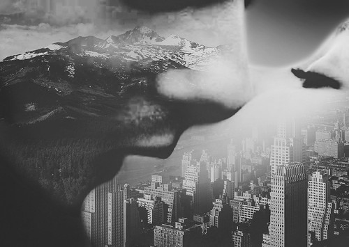
I said that surrealism was one of my favourite movements, but I didn't know that modern surrealism existed! Modern surrealism is, I suppose, the movement that most of my favourite photographers fall into. It deals greatly with image manipulation, with making things look unreal, and I could never get enough of it.  

Like surrealism, when it comes to film this would be achieved with double exposures, putting things onto the negative, blending two negatives and making them one. It obviously got easier when the digital age came along, with the advent of programs like Photoshop and Illustrator.

I know, without a doubt, that my love of this movement stems from my love of reading and writing fantasy novels. The two go hand in hand. 

Jerry Uelsmann
Since I already know a fair few modern surrealists who use Photoshop as their main tool, I wanted to take a look at somebody who was doing this before the digital age came into being. Uelsmann is one such photographer.

Some of his images are so simple and yet so breathtaking. Then the more complex ones just blow my mind and make me wonder how he managed to do it.